


Sean's Graphics Gallery (art)
Started by
Sean
, May 08 2005 12:22 PM
225 replies to this topic
#151
Moogle
-

- Members
-

- 1035 posts
Freeware Fanatic
Posted 29 March 2006 - 12:13 AM
Mmmm, the font is a tad hard to read, and personally I think the border is a bit too red, as in it sticks out too much, but overall its pretty good ^^
#152
Sean
-
- Members
-
- 1265 posts
Just call me Mr. Magic!
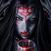
Posted 29 March 2006 - 07:00 PM
Fair comments, can't say I disagree. Lazyness more than anything. I've attached the other three mock-up designs to that post. The final thing should be done tonight, I'll post it when I get around to making it 
Me>You
#153
Frodo
-
- Admin
-

- 9535 posts
Your neck looks very... tasty!
Posted 29 March 2006 - 07:20 PM
I like the 3rd one, with the yellow tank and no soldier.
Please click on my dragons to help them grow - 


#154
PrejudiceSucks
-
- Members
-
- 1865 posts
Freeware Fanatic
Posted 29 March 2006 - 07:21 PM
The border on the third one is best, you should use that effect for the text, and make it an easier-to-read font.
Stencil could look quite nice, although clich�d.
Stencil could look quite nice, although clich�d.
#155
Sean
-
- Members
-
- 1265 posts
Just call me Mr. Magic!
Posted 29 March 2006 - 07:26 PM
PrejudiceSucks, on Mar 29 2006, 07:21 PM, said:
The border on the third one is best, you should use that effect for the text, and make it an easier-to-read font.
Stencil could look quite nice, although clich�d.
Stencil could look quite nice, although clich�d.

Me>You


#157
DeathDude
-

- Members
-
- 6270 posts
Duke de la Review
Posted 04 April 2006 - 01:45 PM
Nice work dude really like 2nd banner of the first set and 3rd banner of the second set as it looks the best of the 4.

http://www.last.fm/user/DeathDude/Upcoming Concerts will be attending, 5/10/08: Dream Theater, 5/12/08: Gigantour, 5/16/08: Nightwish, 5/27/08: Rush, 6/5/08 and 6/6/08: Iron Maiden, 7/27/08: Judas Priest,
#158
Frodo
-
- Admin
-
- 9535 posts
Your neck looks very... tasty!
Posted 04 April 2006 - 03:43 PM
Nice signatures Sean. 
Highlanders Of Canada - I like the last one. That symbol just seems to get in the way, and take away attention from the main picture.
Espionage - I like the second one, with soldiers and boxes. Brilliant font.
Highlanders Of Canada - I like the last one. That symbol just seems to get in the way, and take away attention from the main picture.
Espionage - I like the second one, with soldiers and boxes. Brilliant font.
Please click on my dragons to help them grow -
#159
Sean
-
- Members
-
- 1265 posts
Just call me Mr. Magic!
Posted 04 April 2006 - 09:46 PM
Thank for both for your feedback.
@Dude - I disagree, that symbol I added simply because I was asked to. I couldn't work it in that well and I just think it makes everything look a little sloppy. Hopefully others aren't as demanding as myself when it comes to perfection. Thanks for your comments, I love to get feedback
@Frodo - I agree with you, as I said that logo thingy was part of the actual request. I sent him all 3 and he'll pick whichever he likes most. I think the third is cleaner and more "professional". The font effect for Espi was quite simple to make, the screenshot I used for the background was pretty damn big. I took a new font I'd downloaded and cut the shape of his name out of the screenshot, using the snow to get that feel. I think it worked quite well, looks nice at least
Thank you both for commenting
Me>You
#160
Sean
-
- Members
-
- 1265 posts
Just call me Mr. Magic!
Posted 11 May 2006 - 04:56 PM
New Signature Graphic

Me>You
#161
A. J. Raffles
-

- Members
-
- 6304 posts
The Grand Inquisitor
Posted 11 May 2006 - 05:03 PM
Nice technique, but don't you think the contrast between Mr N7 and the background is a bit too strong? It looks as if he's standing in front of a poster - is that the intended effect?
The top right corner looks a little too dark, by the way.
The top right corner looks a little too dark, by the way.

"Flippin' immigrants, stealin' our bandwidth etc. etc." - PrejudiceSucks
#162
Sean
-
- Members
-
- 1265 posts
Just call me Mr. Magic!
Posted 11 May 2006 - 05:59 PM
He's not suppoused to pop out too much, I kind of like how he came out though.
The top right of the corner is this...

The top right of the corner is this...
Me>You
#163
A. J. Raffles
-
- Members
-
- 6304 posts
The Grand Inquisitor
Posted 11 May 2006 - 06:06 PM
How about turning that dark corner into Mr N7's shadow, then? That might move him a bit further into the picture.
"Flippin' immigrants, stealin' our bandwidth etc. etc." - PrejudiceSucks
#164
Sean
-
- Members
-
- 1265 posts
Just call me Mr. Magic!
Posted 11 May 2006 - 06:22 PM
Yeh, sounds pretty interesting.
I'll to ask Tai about how I'd go about doing something like that. I'm personally not too sure
I'm going to redo the text I think, has a bit off an odd feel to it.
Any other suggestions?
I'm thinking of perhaps "chaos-colouring" which basiclly means I'll use multiple palletes instead of the monochromatic purple that I have there. Worth a shot?
Me>You
#165
taikara
-

- Members
-
- 2389 posts
Tai-Fu Mastah
Posted 11 May 2006 - 06:34 PM
The text was actually the only thing that really bothered me, as I told Sean on MSN.
I'm a little confused about turning the dark bit into Mr. N7's shadow - there are several ways I can think to do so, some easier than others, but I'm unsure what you guys actually have in mind. Shadows can appear in many different varieties
A close-hugging, outlined shadow? A faded, ambiguous shadow? etc...
..<[[[Tofu Ninja of the Pickasldawessle Order]]]>..
doodoodoo!!!
QUOTE (Tai - in response to DD on how people who fear change are like cats)
you mean the "you moved my litterbox, so I'm going to pee in your clothes hamper" attitude?
Yes, I just quoted myself. ph34r my T4i-F00!!. doodoodoo!!!


