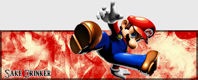
The better the resource pic, the better the sig.
Look for excellent quality resource pics, or make your own. Blurry pics, badly dithered pics will just detract from the overall quality of your sig. You *can* fix badly dithered jpegs and pngs by carefully blurring areas of the same color. You can also remove elements of a resource pic that you don't want to include.
Use interesting cuts and crops that bring out the best in the resource pics you use.
There are various methods of cutting out pictures to use in a signature. One of my personal favorites is using a freeform pen tool to create a shape that matches the area of the pic I'm trying to cut out, then making the shape into a selection and use the selection to cut out the area. This is the cleanest way I've discovered, and doesn't leave an outline.
You can also "bluescreen" the background and carefully paint around the area you want to select, and use a magic wand selection, but this sometimes gives an outline.
You can also use a lasso tool to carefully click around the area to make a selection, but this can be very time consuming.
When you crop images, don't be constrained by the idea that you must make the image fit the signature area. Use interesting crops that let part of the image overlap the bounds of the sig. Since you're working with a limited area, making an image fit will often end up with an image that's very hard to make out details on.
Resize intelligently.
When you resize to make an image smaller, up the color depth before doing so, this will preserve the details, making a nicer image. Never resize to make a picture bigger, it will always look bad. Start bigger, make it smaller as necessary.
Boring lines makes for a boring signature.
If you use only horizontal & vertical lines in your design, it will be pretty boring. Make sure that the design makes the viewer follow different lines... diagonal, circular, wavy... You can use color and contrast to create the illusion of lines in an image that will draw the viewer to look at all aspects. You can also use the natural borders of your images to create an illusion of lines.
Boring font also makes for a boring signature.
Your default font library is littered with a bunch of boring font that will never amount to a spectacular design. There's tons of free fonts available on the net, go look them up. It takes patience, but it's worth it.
Don't forget to play with font effects... often, simple is best, but an outer glow in the right color in size can make all the difference in the world.
Also, outer glows tend to work better for most "flowing" fonts than strokes. You can achieve the same effect as a stroke, but it will be more tweakable, and often less choppy.
If you have an idea, but don't know how to achieve it, look it up.
There are thousands of tutorials online for all sorts of different graphics programs. Background effects, text effects, techniques, etc. Don't be afraid to look it up, or ask someone who might know how, it will increase your ability, and make all the difference in the world.


